


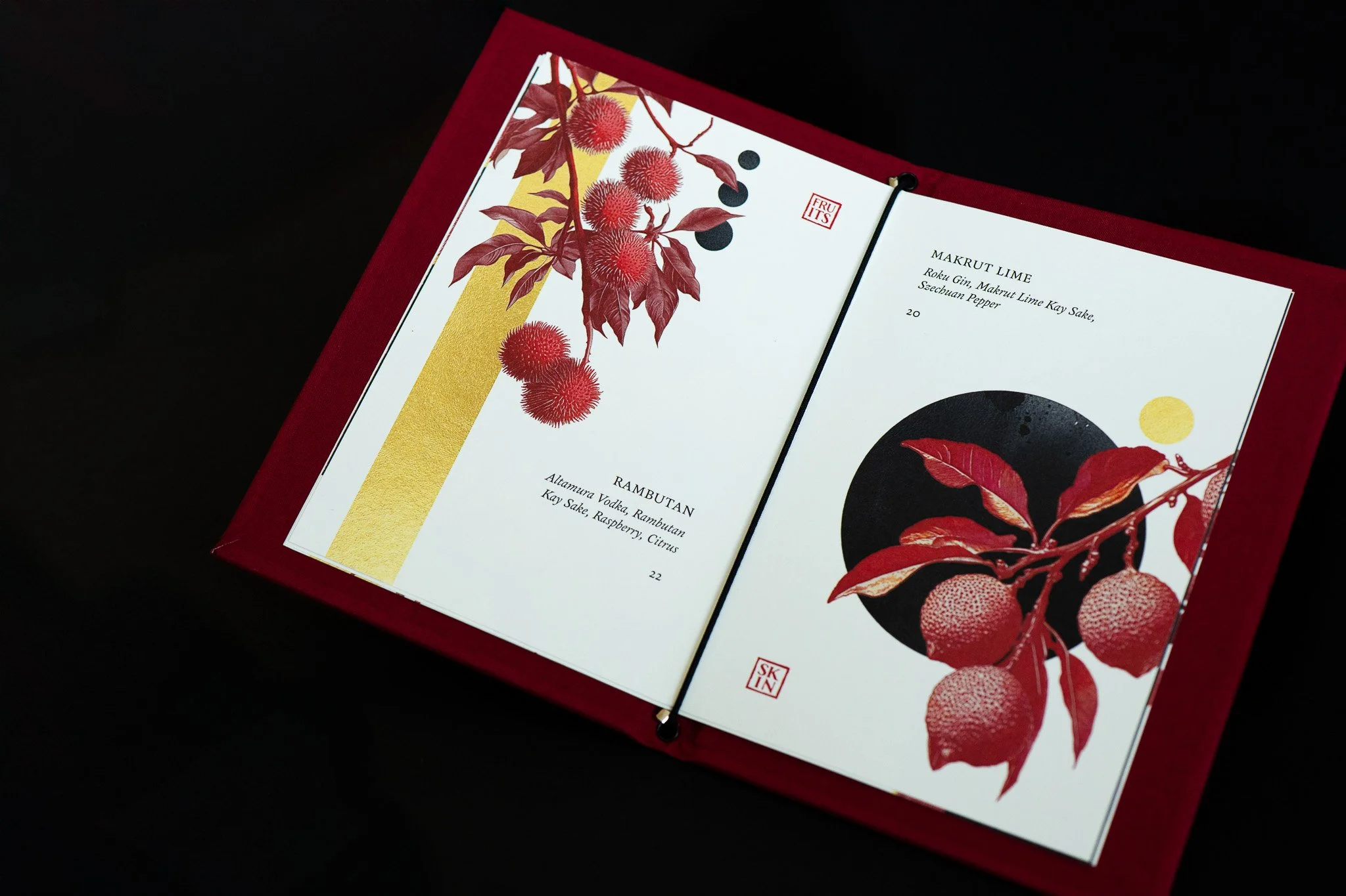
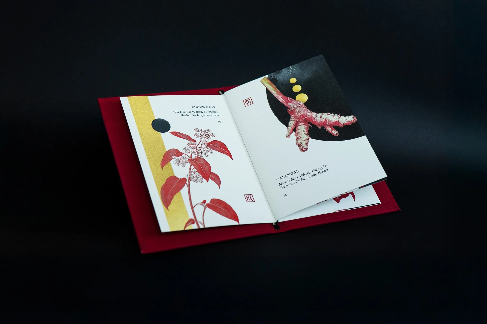
TEXTURE IS EVERYTHING
GRAPHIC DESIGN | ART DIRECTION | PRINT DESIGN
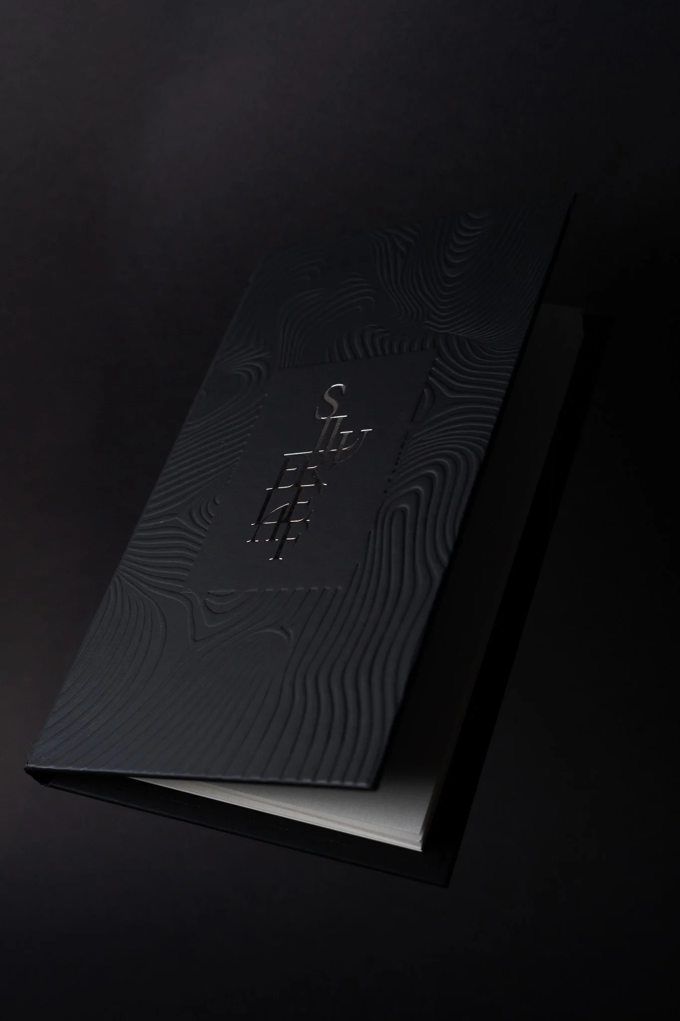
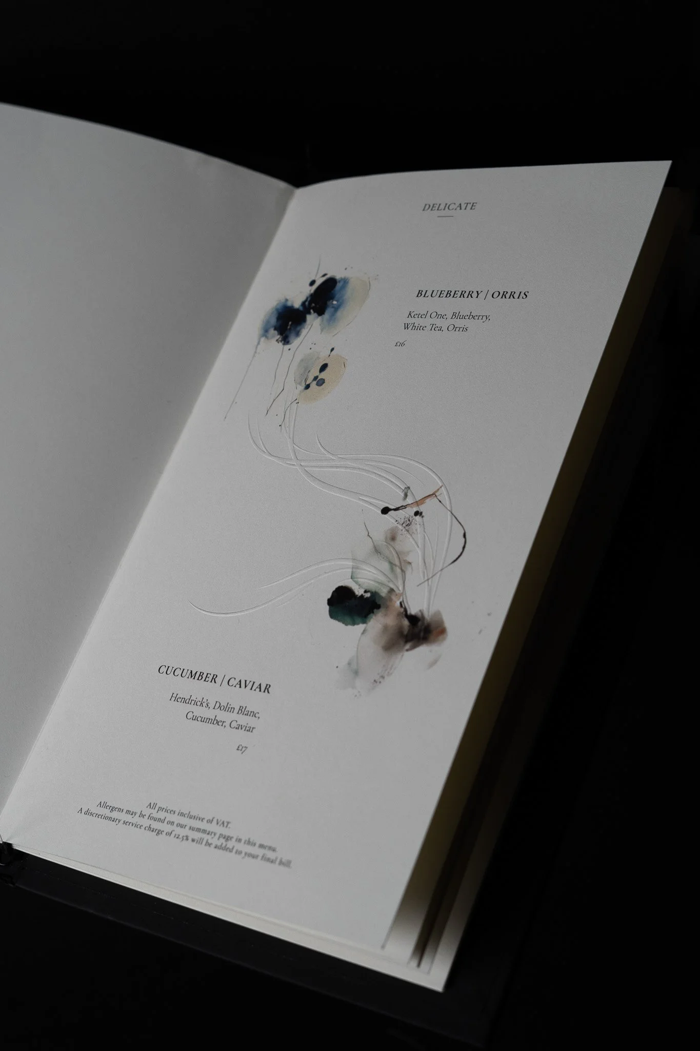
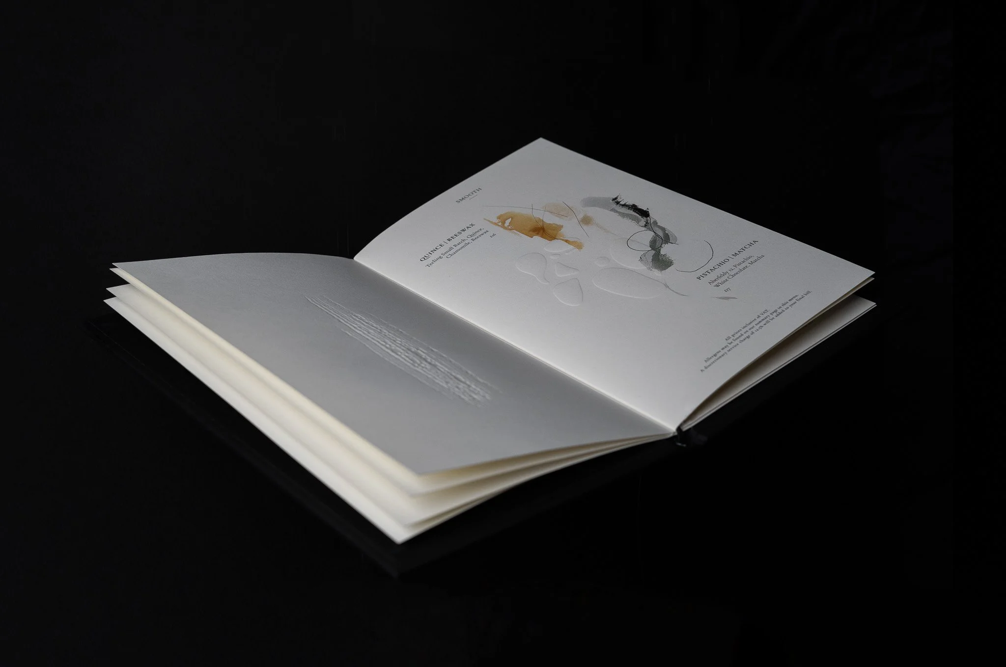
Texture is Everything is the third annual menu of London-based cocktail bar Silverleaf, exploring the interplay of textural experiences within tactility, design, and cocktails.
In keeping with Silverleaf’s meticulously curated and artistic menus, Texture is Everything presents an abstract perspective on the way we experience cocktails through touch. Initially inspired by the textures found throughout the bar, the menu is split into six categories, each representing the texture of the drinks.
In order to translate the concept into a multi-sensory experience, each section is blind embossed to represent a mouthfeel, accompanied by abstract illustrations that represent the flavours of each cocktail. The goal of Silverleaf’s third menu is to present the experience of cocktails as a multi-sensory and immersive one.
HYPER DRINKS: THE BOOK
GRAPHIC DESIGN | ART DIRECTION | PRINT DESIGN | PHOTOGRAPHY
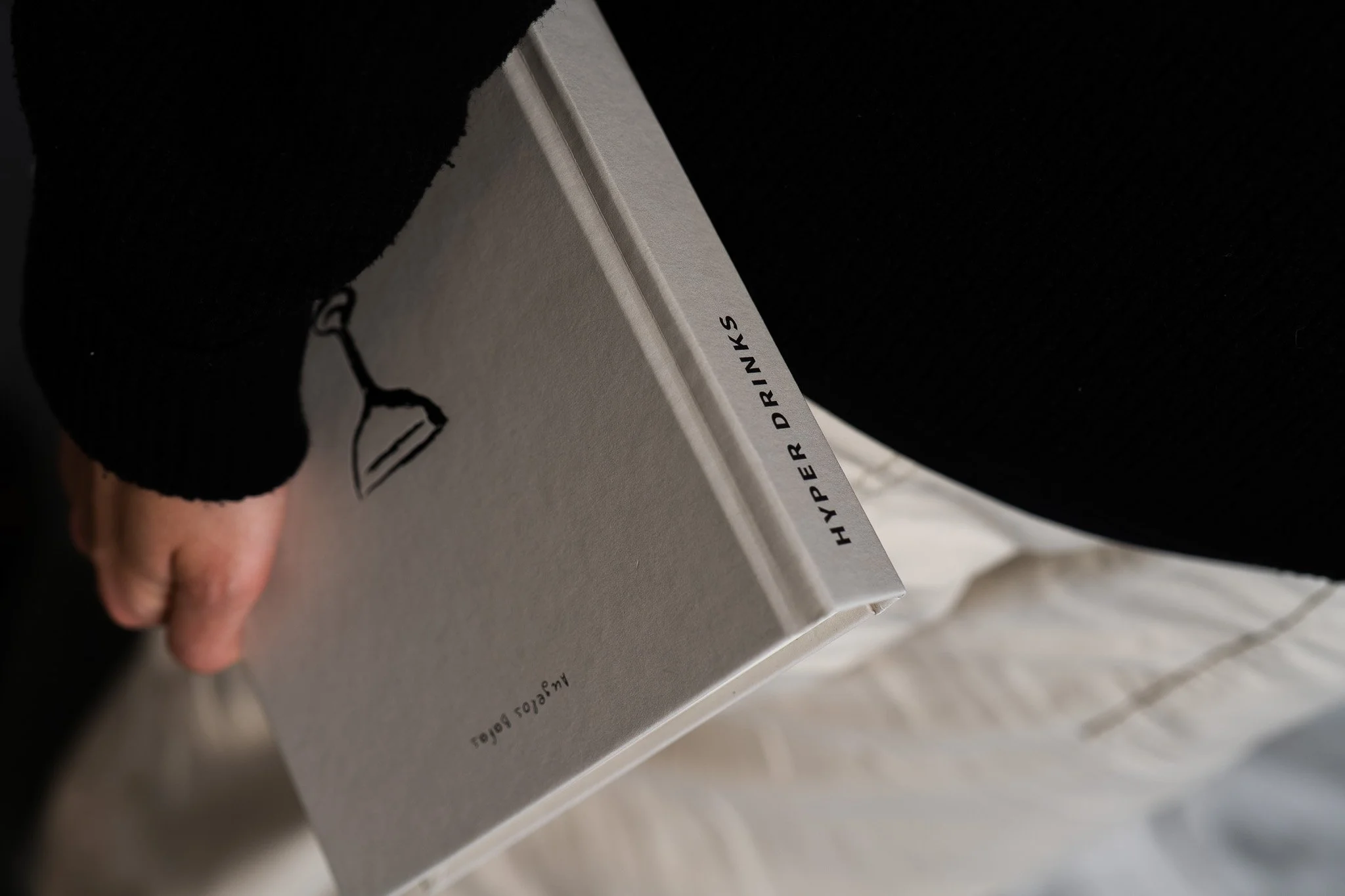
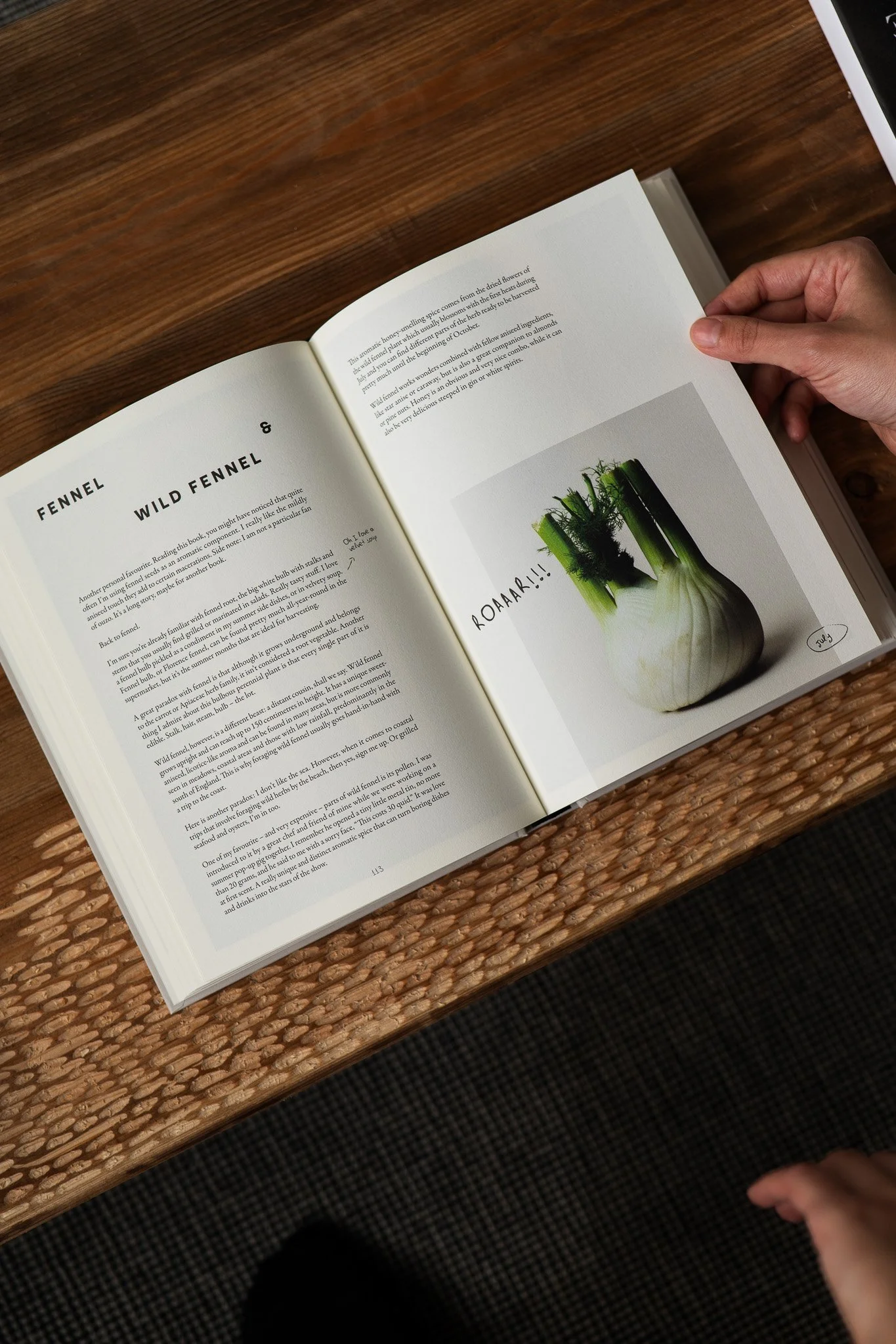
HYPER Drinks is a book of cocktail recipes and personal stories written by Angelos Bafas, focusing on hyper-local and hyper-seasonal ingredients. It marked the launch of the HYPER brand, for which Studio Highball was commissioned to create the branding, produce photography and book design.
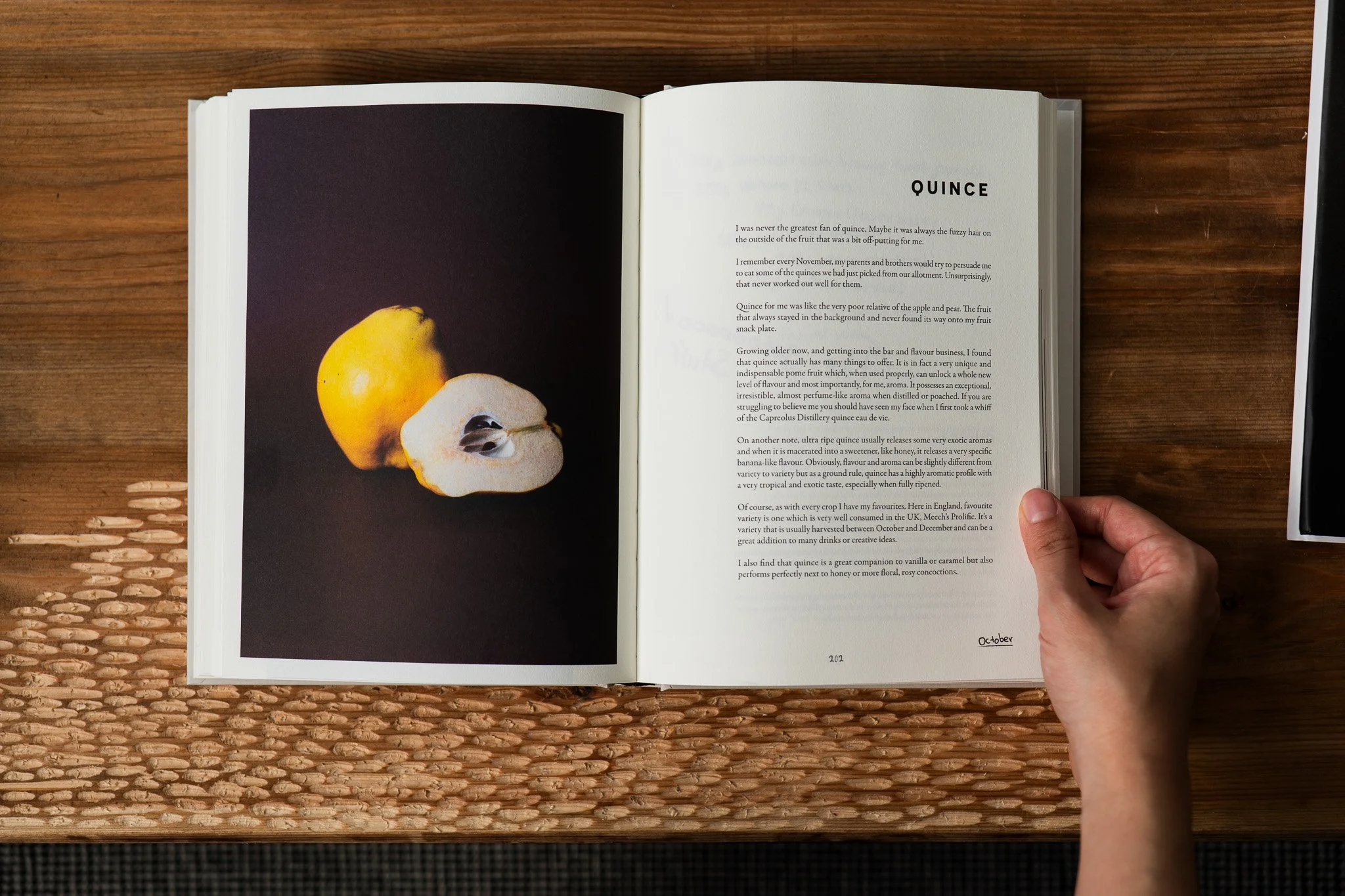
The book features a hard cover with a custom debossed and foiled Illustration, and follows the visual language of the HYPER brand, with a minimal aesthetic, a custom made handwritten font and bespoke photography.
Author: Angelos Bafas
Editor: Millie Milliken
Drinks photographer: Carla Barber
Produce & drinks photography: Studio Highball
Art Direction, branding & graphic design: Studio Highball


GONG BAR: NATURE & EARTH
GRAPHIC DESIGN | ART DIRECTION | PRINT DESIGN
Nature & Earth is Gong Bar’s latest menu, exploring the different stages of a plant’s lifecycle through drinks. Each drink is represented by an illustration that reflects a point in this cycle. The design direction focused on grounding the concept in natural forms while maintaining a sense of refinement.
The menu was printed on textured paper to reinforce the organic theme, with the proposal of gold foiling to introduce a tactile detail and subtle luxury edge. Colour choices and layout referenced Gong Bar’s existing brand identity, while incorporating Asian influences present in the bar’s design language.
